The Food Systems Dashboard – Understanding the Сomplexities of the Food System
The data behind what we eat and how it’s produced should play a critical role in informing policies that support healthy people and planet. But this data has been fragmented, confusing, and difficult for policymakers to use. The Food Systems Dashboard is changing that by making food systems data and insights accessible to all, especially for decision makers who need it most.
The FSD states that it is one of the most comprehensive tools around for crunching data from farm to fork at both national and subnational, or regional, levels. Analyzing the impact of the food system on human and planetary health, it reveals and analyses the complex mix of issues which make up the narrative arc of food production.
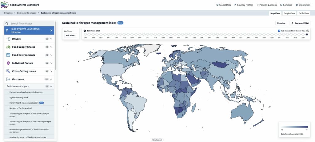
According to the initiative, the platform is unique in terms of offering data on all main components of food systems presented in a visually appealing, easy to use format of maps, graphs, and tables, allowing users to compare and explore data by country, region, food system type, and country income group.

The FSD’s analysis is based on three pillars: «Describe,» «Diagnose,» and «Decide.» The first gives us a fascinating insight into what it takes to bring our food to the table; almost 300 indicators provide users a complete view of global food systems, from government policies to agricultural production and climate challenges issues. Data is sourced from over 40 agencies including the United Nations, World Bank, CGIAR, and Euromonitor.
The Diagnostic tool pulls focus on each country’s strengths and weaknesses, drilling deeper into its food supply chains, food environments (the physical, economic, political, and socio-cultural contexts of where we get our food), nutrition, health, and environmental impacts with a traffic light system giving clear alerts. For example, in Mozambique, greenhouse gas emissions from food consumption are coded green as an unlikely challenge area, while the biodiversity impact of food consumption is red.
The FSD brings together data on both the macro (national) and micro (subnational) levels, highlighting areas which have achieved balance, while showing clearly that no single country has got it right. The substantial agricultural yield gaps in lower-income countries, which are a major contribution to hunger as well as inefficient use of natural resources, are set against the excess consumption of sugar-sweetened drinks and ultra-processed foods in higher income countries.
Without this rigorous analysis of how food interacts with the planet, societies, and human health, decision makers are unable to improve food systems’ environmental sustainability through the choices they make. Through its «Decide» function, the FSD shows stakeholders how to use its evidence to find better solutions.
And it’s happening; the Country Dashboards, which dig into the subnational data across various administrative levels to supplement national averages, are a powerful tool for locally led evidence-based decision making and are already becoming embedded in governmental decisions; Indonesia uses its dashboard in its Ministry of National Development Planning. Countries dedicated to achieving the goal of food systems transformation by 2030, as outlined in the UN Food Systems Summit, utilize the subnational dashboards as one of the vital tools for governments to track progress. Launched in 2023 and 2024 the first Country Dashboards now exist for Bangladesh, Indonesia, Kenya, Nigeria, Mozambique, and Pakistan, bringing together subnational data that covers almost one billion people and informing decisions which could affect their lives. This year, work has also started on Dashboards in India and Rwanda, expanding FSD’s coverage to almost 2.5 billion people. With requests from governments in Tanzania, Benin, and Ethiopia, the FSD’s vision to play a critical role in supporting a healthy food planet is already becoming a reality.
Learn more about the Food Systems Dashboard.
